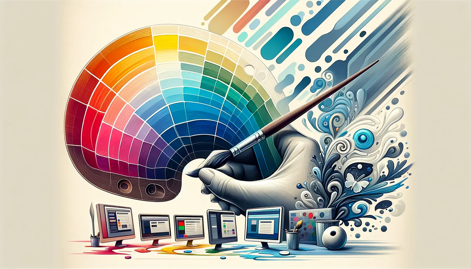
Understanding how to use color theory in computer graphics is essential for any designer. Color theory helps you choose the right colors and combinations to create appealing visuals. It enhances the effectiveness of your designs, whether you’re working on a website, a logo, or any other graphic project. In this article, we’ll share practical insights on using color theory to improve your computer graphics.
Understanding the Basics of Color Theory
Before diving into applications, it’s important to grasp the fundamentals of color theory. At its core, color theory is about understanding how colors interact with each other. The color wheel, created by Sir Isaac Newton, is a great starting point. It displays primary colors (red, blue, yellow), secondary colors (green, orange, purple), and tertiary colors, which are combinations of primary and secondary colors. Familiarizing yourself with this wheel is the first step in how to use color theory in computer graphics effectively.

The Role of Color Harmony
Color harmony refers to the pleasing arrangement of colors. Using harmonious colors can create a sense of balance and attract attention. There are several methods to achieve color harmony:
- Complementary Colors: These are colors opposite each other on the color wheel, like blue and orange. Using complementary colors can create a vibrant look.
- Analogous Colors: These are colors next to each other on the wheel, such as blue, blue-green, and green. This combination offers a serene and comfortable feeling.
- Triadic Colors: This scheme uses three colors evenly spaced around the color wheel, like red, yellow, and blue. It provides a vibrant yet balanced appearance.
Understanding these harmonies is vital when considering how to use color theory in computer graphics. They help convey the mood and message of your designs.
Creating Contrast
Contrast is another essential aspect of color theory. It involves using opposing colors to make elements stand out. High contrast can draw attention and improve readability. For instance, black text on a white background is easy to read. Similarly, combining a light color with a dark one creates a striking effect. This principle is crucial in how to use color theory in computer graphics because it enhances user experience and engagement.
Using Color Psychology
Color psychology explores how colors influence emotions and behaviors. Understanding this can help you choose colors that evoke the right feelings. For example:
- Red: Often associated with energy and passion.
- Blue: Represents calmness and trust.
- Green: Symbolizes growth and nature.
- Yellow: Evokes happiness and optimism.
By incorporating color psychology into your designs, you can create a specific atmosphere that resonates with your audience. This approach is a key element in how to use color theory in computer graphics effectively.
Choosing a Color Palette
Creating a color palette is an important step in your design process. A color palette is a selection of colors that work well together. It helps maintain consistency throughout your work. Tools like Adobe Color and Coolors can assist in generating color palettes based on your primary color. When designing, limit your palette to three to five colors to avoid overwhelming your audience. This technique is crucial for how to use color theory in computer graphics.
Testing Your Colors
Before finalizing your design, test your colors in different contexts. Colors can look different depending on the medium (print or digital) and lighting conditions. Ensure your colors remain consistent and effective across various formats. This step is essential in how to use color theory in computer graphics, as it ensures your designs are adaptable and professional.
Understanding Cultural Differences
Colors can have different meanings in various cultures. For instance, white symbolizes purity in Western cultures but can represent mourning in some Eastern cultures. When designing for a global audience, it’s important to consider these differences to avoid misunderstandings. This awareness is part of how to use color theory in graphics responsibly and effectively.
Iterating and Refining Your Work
Finally, always be open to iterating and refining your color choices. Gather feedback from peers or clients to see how they perceive your color usage. Sometimes, minor adjustments can make a significant difference in how your design is received. This process is an essential part of how to use color theory in computer graphics successfully.
Conclusion
In summary, understanding how to use color theory in computer graphics can elevate your design skills. By mastering the basics of color harmony, contrast, and psychology, you can create more impactful designs. Remember to choose a cohesive color palette, test your colors, and consider cultural meanings. With these strategies, you will enhance your graphic design work and connect better with your audience.


